Control Chart: Charts for monitoring and adjusting industrial processes
The Control Charts are used to track the development of the production processes and identify failures and other anomalous circumstances.
In sum, the objective of this analysis is to control processes to ensure they are working properly. If the majority of the points shown on the graph are inside the limits, it’s considered that the process is working fine. But if one or more points are outside of the limits or don’t follow a statistical Gaussian distribution, it is considered that the process is out of control and we will have to search for the cause of the malfunctions.
1. How to use a control chart
The graph shows the results of the developing of a repetitive process (normally, in industrial factories). The obtained results can be a continuous value (eg, the measures of a piece) or can also be a discrete value (eg, if the piece is ok or not). In the case of being continuous values, the graph should include a horizontal line with the average value and two lines more with the control limits, upper and lower.
The control limits are placed so that a fixed percentage of the points are inside them. These limits are calculated to include either 75% or 95% of the data:
– Limits which include 75% of the data: In this case, a process which works properly must show 75% of the values inside the upper and lower limits, 12.5% of the values above the upper limit and another 12.5% below the lower limit. If a point is outside these limits is considered normal, but if there are several points above or below the limits probably represent an unusual situation, and it could indicate that the process is out of control.
– Limits which include 95% of the data: In this case only 2.5% of the values should be above or below the limits. In this situation if a data goes out of bounds mean that there has been an unusual circumstance in the process.
This type of control charts are used to detect if the process is working properly, or if it is in a abnormal situation. When a graph shows a “situation out of control”, you may start an investigation to identify the causes and take actions to correct the problem.
The values shown in the graph should be random and follow a normal statistical distribution, being centered in the midpoint line and having a variability that can be the result of two factors:
– Common situation: The variation which is inherent to the process, and therefore you can not avoid.
– Special situation: When it causes an excessive variation, and should be corrected.
2. When the process is malfunctioning?
We say that a process is out of control, and therefore should be corrected in the following situations:
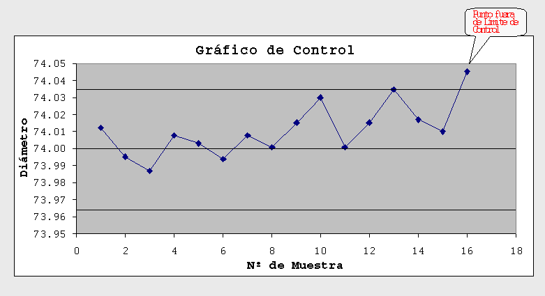
– If there is a point beyond the limits of 95%.
– When more than three points are a row outside the boundaries of 75%.
– When increasing or decreasing trends are appreciated in more than 4 points in a row.
– When more than 6 consecutive points are above or below of the average line of the graph (in this case, the process should need to be recalibrated).
– When it is seen that the values follow a pattern (they should be random).
3. How to draw a control chart?
Normally, in the continuous processes, the machines include their own software to give us the graphs and the control diagrams as they are performing its tasks. But if we do not have this technology, we can also perform a control chart manually using a spreadsheet in order to understand better the current situation of the development of the process.
Create a control chart requires the following steps:
1) Choose the feature to study. It must measure the data that we want to study: the length of a piece, the temperature of a machine, etc.
2) Take the data. We collect the values over a period of enough time to enable us to obtain a representative view of the process development.
3) Insert the data in the spreadsheet, and calculate the center line (the average of the value of the data) and the upper and lower limits.
4) Represent the data in a graph, and consider if the development of the process is the proper.
5) Repeat the study from time to time to verify that the operation remains correct.
Original post: http://www.pdcahome.com/diagramas-de-control/